How to pick the best font for a website

May 2, 2017

Picking up the correct font for your website, application or any piece you are dealing with, is not a simple thing to do. And once you've picked fonts, how to make them work in harmony, is another dilemma.
First approach to the problem:
/ Calligraphy and fonts families are something ALIVE. They’ve been evolving with human culture, as a travel buddy, for almost 5000 years.
/ Fonts communicate, no matter how simple they may be. They always have a subconscious impact on the reader.
/ There are thousands font families and each one offers a solution to a specific need. The main skill to develop is to understand the nature of the project and find the perfect match font for it.
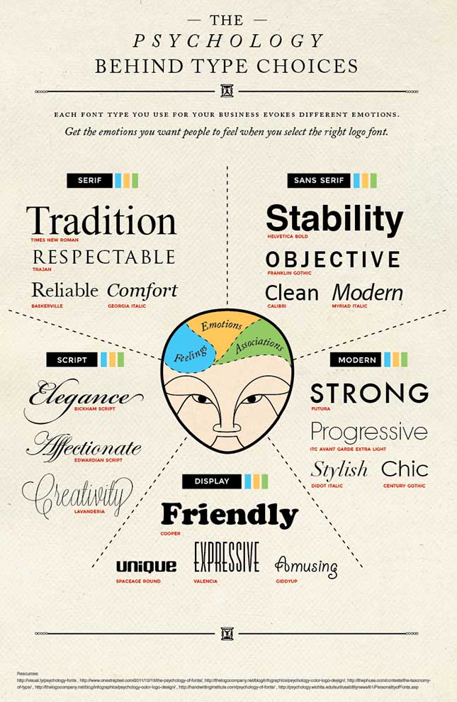
Here is an infographic which help organizing font families in different “moods”:
TIPS:
1 - Understand the nature of your task: fonts hit the goal as long a they align with your needs.
Eg 1: If the project is about a big scientific company the family font should be rational, clean and minimalist.
Eg 2: If the project is about the editorial field such as a magazine or a photographer, Serif fonts could work perfectly well.
2 - Don't mess with too many fonts.
A Web site should be easy to read and visually clear for the user. So two fonts families should be more than enough! Remember you have different elements to enrich the use of each font, such as size (H1, H2, H3, etc), colour, weight…
3 - Compatibility
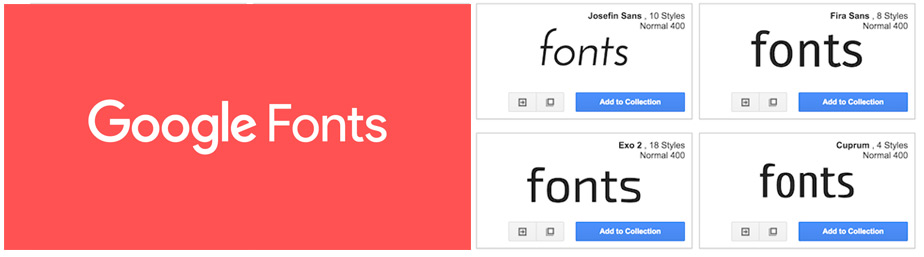
In web design, technology helps and sometimes interfere in free choice and use of fonts. Nowadays the best choice is to pick families from Google Fonts or using the @font-face rule. Designer should have a nice chat about this with the developer assigned to the project. :-)
4. Tone and Message: key features to have in mind
It is vital to ensure that the typeface you select matches the tone and messaging of the project you are working on. Here are some questions to help you map it out:
- Is the project formal or casual?
- Should text be bold or lighter?
- Is the typeface for large text or small?
- How will it pair with color or images?
- Does the mood of lettering match the words being read?
5 - Harmony between font families in the same website.
Different families can match or be really nasty. The eye of a developer gets tired after hours of trying stuff. So you can try a few matching options between two fonts and:
- Ask all kind of people to give you an impression.
- Look for similar projects online to check if they work alike.
Hope this tips can help in your daily working day!
See ya next time.
Pablo.


 Recent Posts