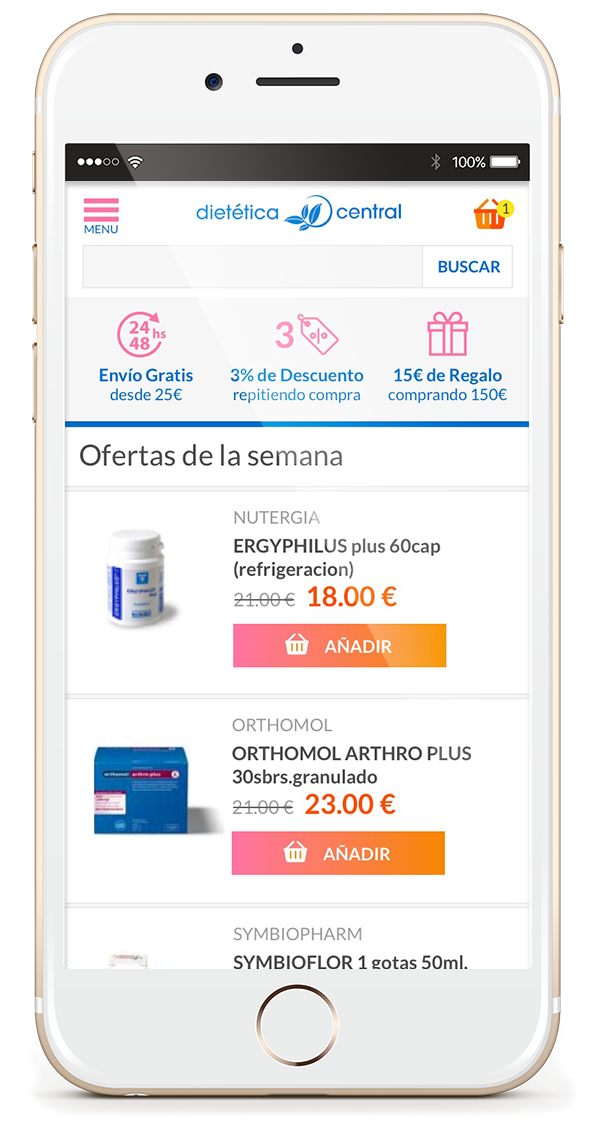
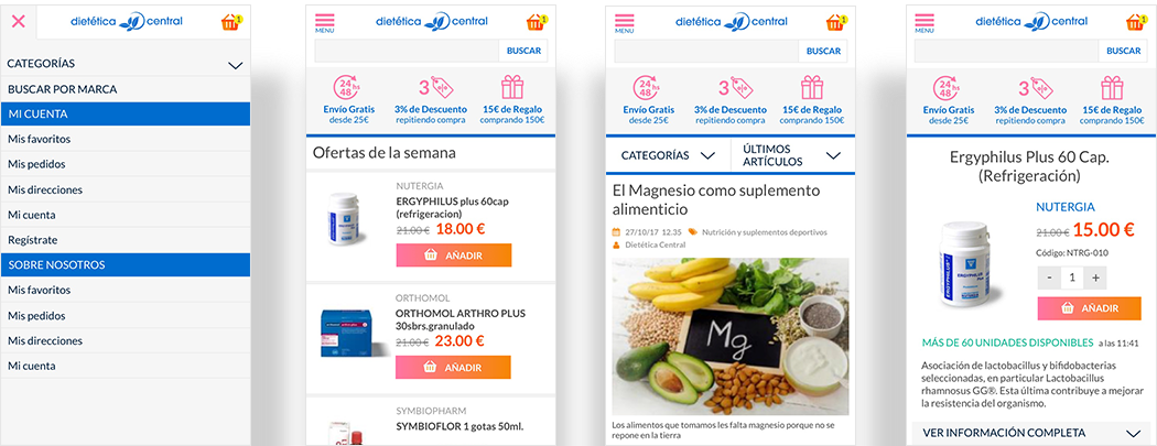
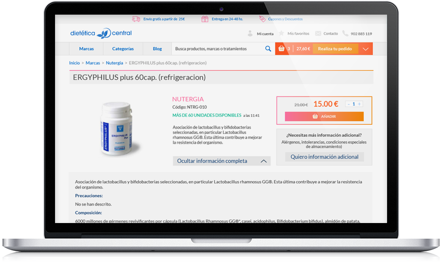
The client was unsatisfied with the functionality and the experience their online marketplace offered. It was chaotic, untidy and the colours weren’t attractive. In order to attract users and gain conversions we built a business oriented design plan where the UX and UI had been rebuilt from scratch.
UX/UI

RESPONSIVE AND CONTENT DESIGN
All the project should look clean and coherent. The users must navigate comfortably and find the easiest way to buy the product they needed. After testing and adjusting almost every feature we’ve come to the final version.
FONTS, COLORS AND HARMONY
The experience and conversions are not only achieved by simplicity or functionality, but with a great atmosphere too. Like in any uncomfortable environment, we all tend to leave the place. An app, site or marketplace works in a similar way. The more refined a site is, the more conversions will provide.

Need help with your project?


 copywriting
