We love this job: another great web application launched!
The client intention was clear: to improve his grants and subsidies search engine. It didn't give the results expected. The content architecture wasn’t clear and the usability quite chaotic. SEO wasn’t giving results either. As many other startups, the idea was good, but the first implementation didn’t reach the expectations.
We had to push forward this project asap. As usual, the client was in a rush… :-)
We reorganized the whole navigation diagram aiming for simplicity. The data base had to be migrated and also demanded some work. Also, we had to review copy, content, visual direction and most important, the search engine and SEO. So we provided the client a new version of the UX, design and a database reorganization plan.
The new design should be more mature, simple and professional. Easy to use. The main goal was to allow the user find the grant or subsidy needed with the aid of a complete filter bar.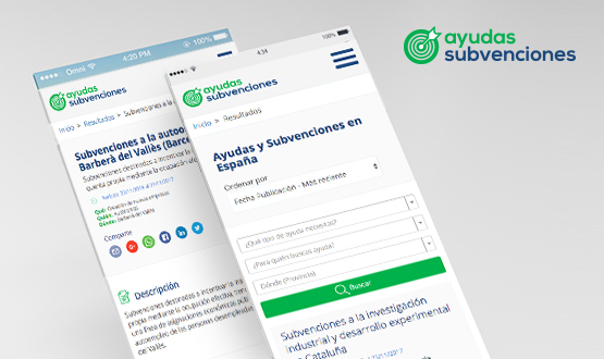
Time wasn’t on our side, with only 5 weeks to solve everything, the working speed became frenetic. Everyone involved had to understand the whole functionality: design must articulate with the database, database with SEO and SEO with content direction. This wheel started to roll and soon we all worked as an efficient engine.
Other big concern was the navigation experience. The color and font family, icons or illustrations, they all must merge into a minimal visual proposal. Art and design can provide originality and visual impact. Webs tend to get too “digitalized” and our goal is to give a human feeling to the front end. Illustrations contribute to add an editorial feeling to the navigation too.
So another MVP is launched, and we believe will scale with time and become a big and strong tool.
We feel good. We love this job.
See ya guys!


 Recent Posts